01
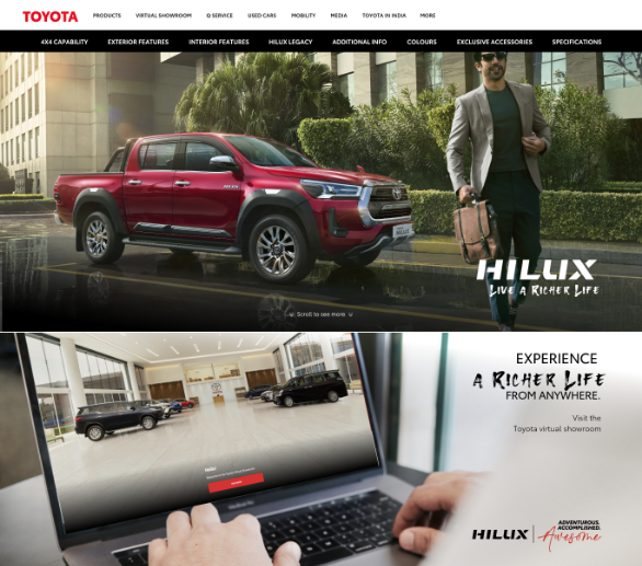
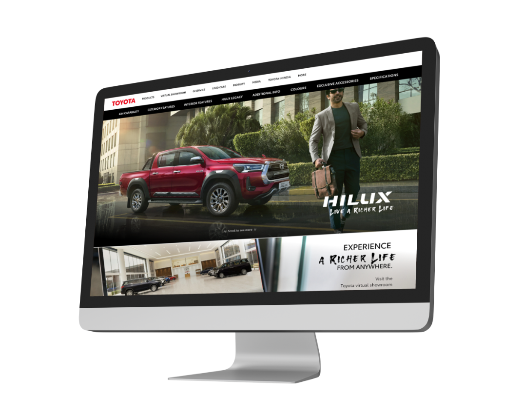
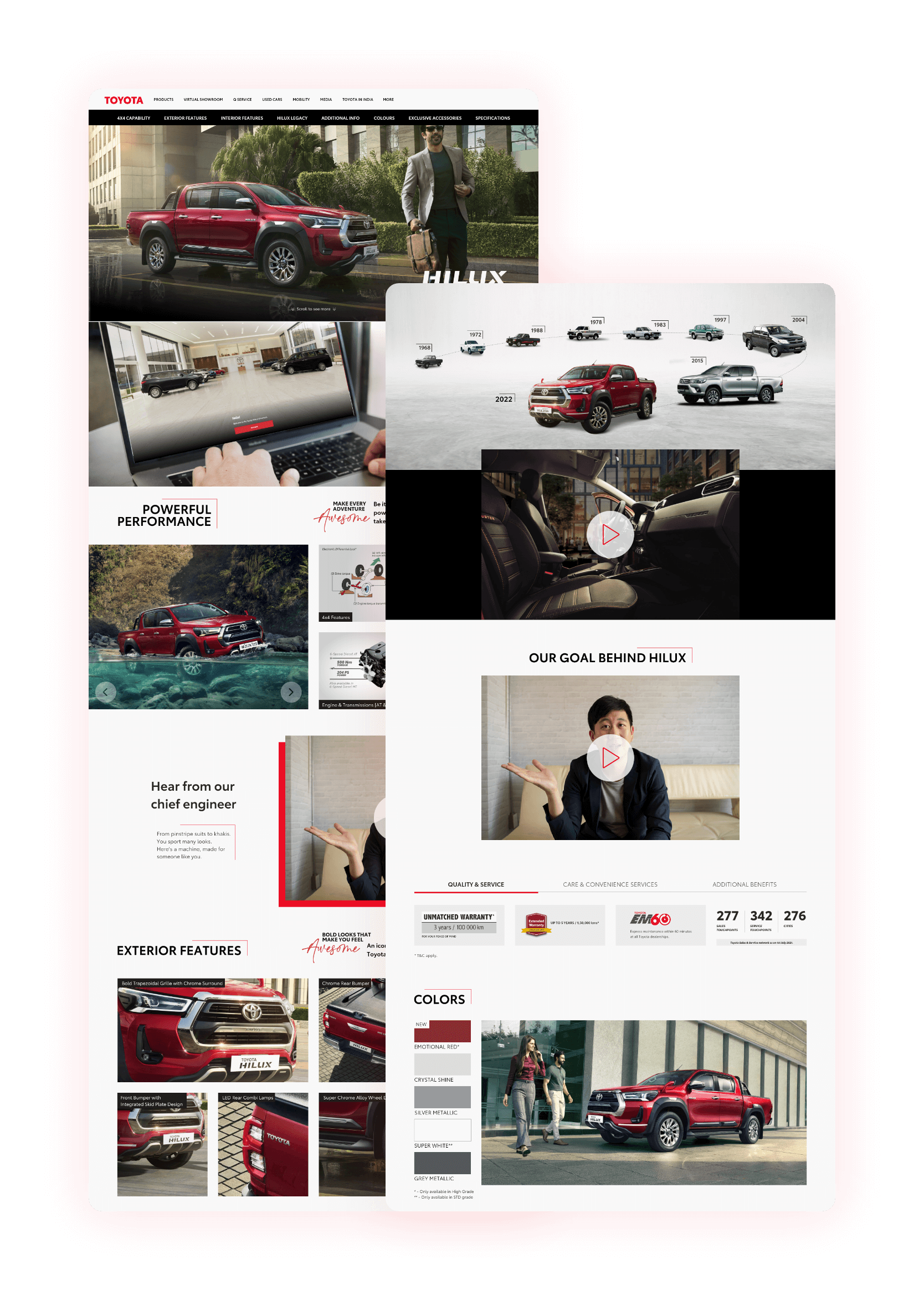
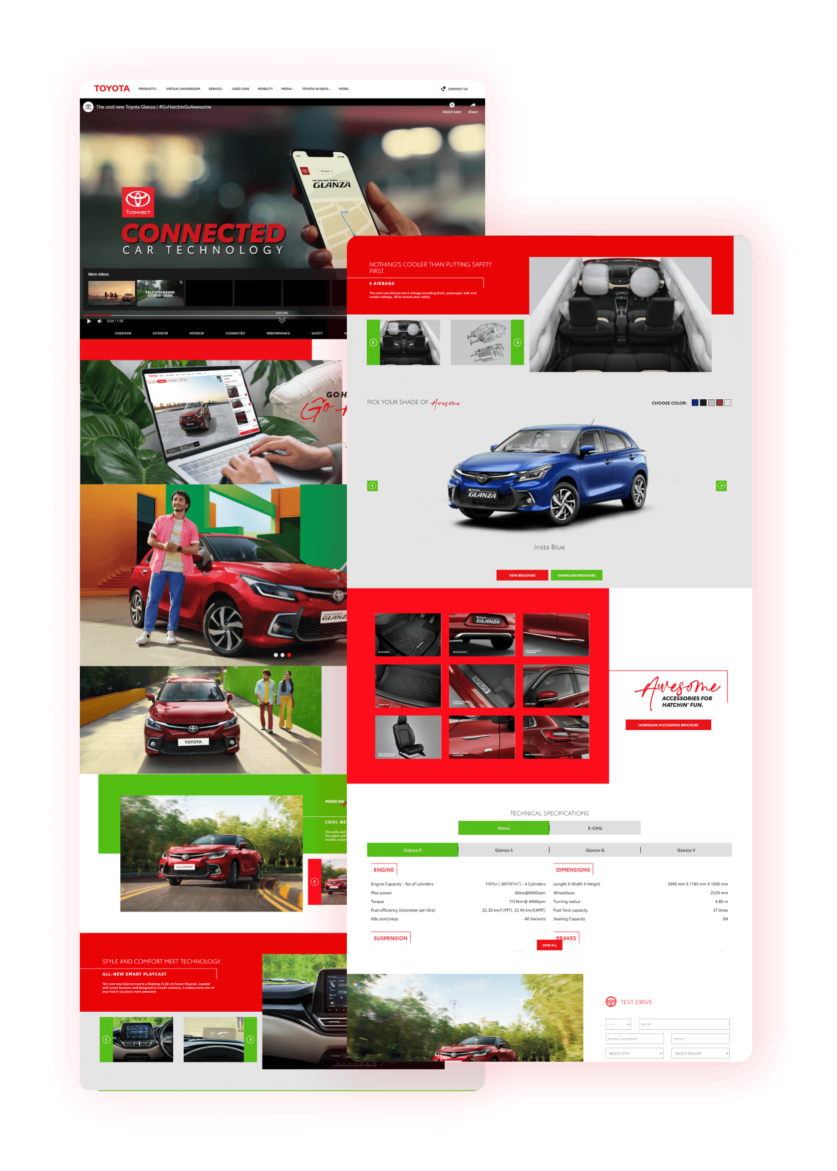
Toyota is one of the world's largest automobile manufacturers. They create cars and trucks that facilitate you and your family to travel reliably and safely. Even though they build trucks with cutting-edge technology, their website looked like the shell of a broken-down truck abandoned in the desert, an outdated and abandoned website. As a result, they sought to gain a competitive advantage by improving their website design, thereby increasing conversions.
02
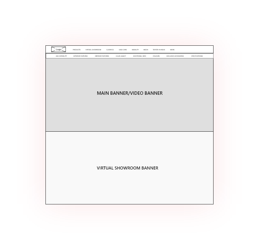
There are numerous factors and angles to consider when creating a great website design . As a result, we focused on well-defined content strategy and information architecture. In order to create a fantastic offering, we must also understand our target customers. This is a crucial part of the process because it provides us with insight into their needs and helps us create a user-friendly website design that will keep them engaged..
03
Anything we design, we design it for users. We believe that by putting people first, we can create truly innovative products that improve lives. Our team used a combination of user testing and analytics to understand how users interact with the platform. We created personas and scenarios to help us focus on the goals of each user group, rather than just focusing on features. We designed a simple intuitive interface so users can get started right away.
04
Red is the color of energy. It is highly visible and conveys the Toyota spirit of excitement. Based on this, color palette shown below is used for Toyota.
#EB0A1E
#2A2522
#000000
Toyota Type
Headline
Toyota Type - Semibold
Title
Toyota Type - Book
05
06
Take a look at what one of our satisfied customers has to say.
© Copyright 2021 - Bombay Tone