Joy Personal Care
Provides personal care products that help you maintain your beauty and not accentuate it.
-
UIUX DESIGN


01
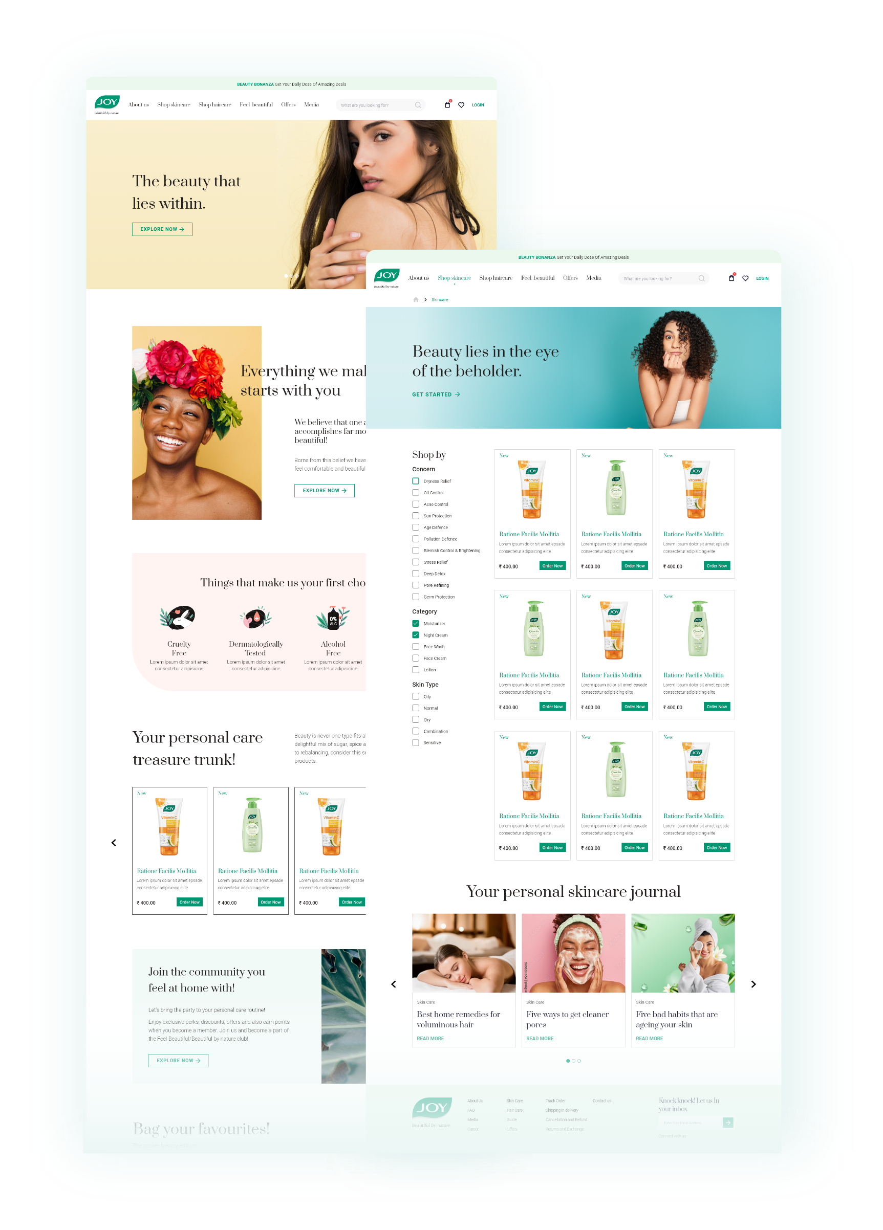
Joy Personal Care is the 6th largest, Indian -origin skincare brand, that promotes personal care in an organic and affordable personal way. With the idea to bring about a revolution to deliver the best of consumer hygiene and personal grooming for both men and women, they wanted us to revamp their pre-existing e-commerce platform to gain a competitive edge by making the shopping experience more convenient and widely reached.

02
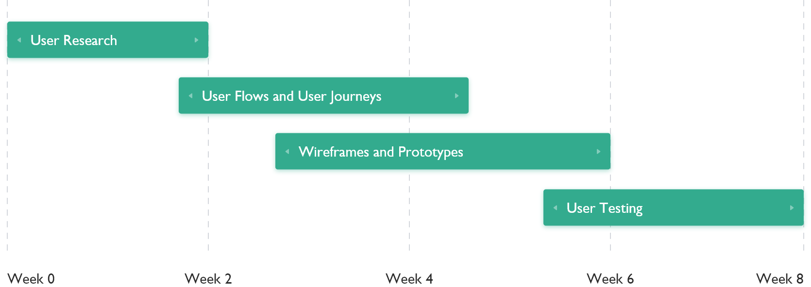
We used our client's branding and insights to convert business requirements into a seamless usability experience. This included a human-centered approach, starting from the first stage of the process, which is discovering the problem statement, defining the challenges and opportunities to tackle them according to the needs of the target audience, ideating, and prototyping to validate the experience.
03
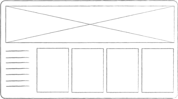
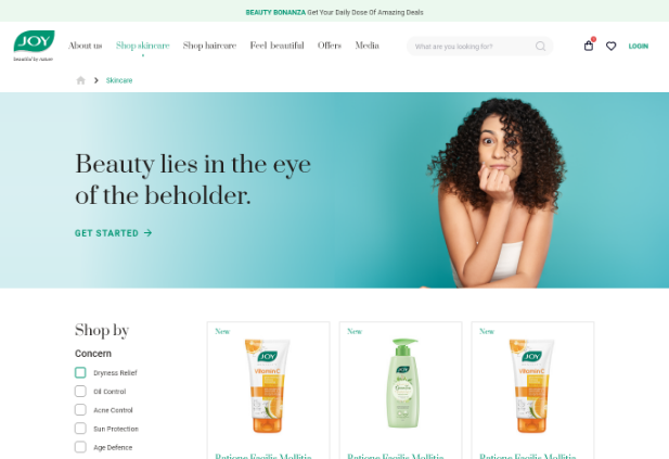
With the help of previous data collected, we gathered ideas on how to improve the existing interface. This was done by updating the UI styles, patterns, and changes in user requirements making the e-commerce platform more easily accessible. Keeping the target audience in mind, we tried to make the experience more user-friendly, where the users can browse through different categories of skin care products and get the required information for the same.
04

05
Green is a dominant color in nature which represents nature. Out of all the colors on the color wheel, green is regarded as the most restful and relaxing color for the human eye, symbolizing harmony, tranquility, and peace.
#009672
#33AB8E
#66C0AA
#99D5C6
#211E1C
Prata & Roboto
Headline
Prata - Regular
Title
Roboto - light

06
The icons and picture styles listed below are used to aesthetically enhance and clearly represent an idea.
07
© Copyright 2021 - Bombay Tone