BridegeStone
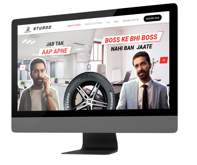
Sturdo gives Longer tyre life of up to 29% better than standard tyres without compromising on other tyre Performance parameters.
-
UI/UX
-
Digital Marketing

01
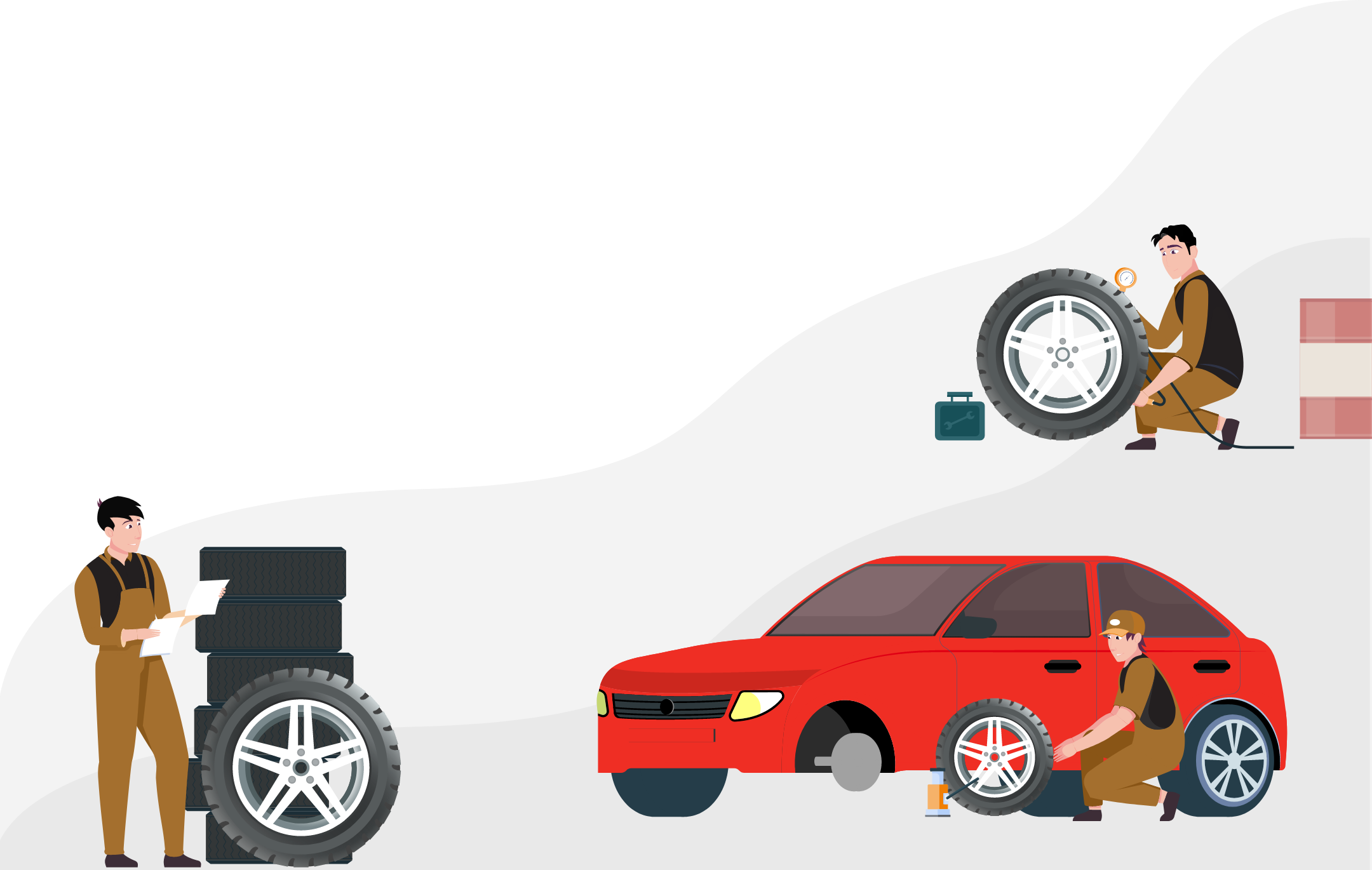
Bridgestone is No1 tyre company for highway tyres on Indian roads. They provide wide range of tyres for cars, SUVs, CUVs, luxury cars, trucks and buses in India. But the amount of effort taken by a user to change the tyres of his vehicle is long and often results in poor buying choices. So they came to us with the intent of improving customers’ digital journeys. They felt that by improving the website experience it would be easier for their customers to choose the right tyres.

02
Our challenge was to create an easy-to-use experience that would enable users to get the right tyre for their vehicle. We used extensive research data and insights from the user interviews to build a product that would help customers make better decisions. Our design process was challenging, but ultimately rewarding. We made many iterations and changes to the product based on user feedback.
03
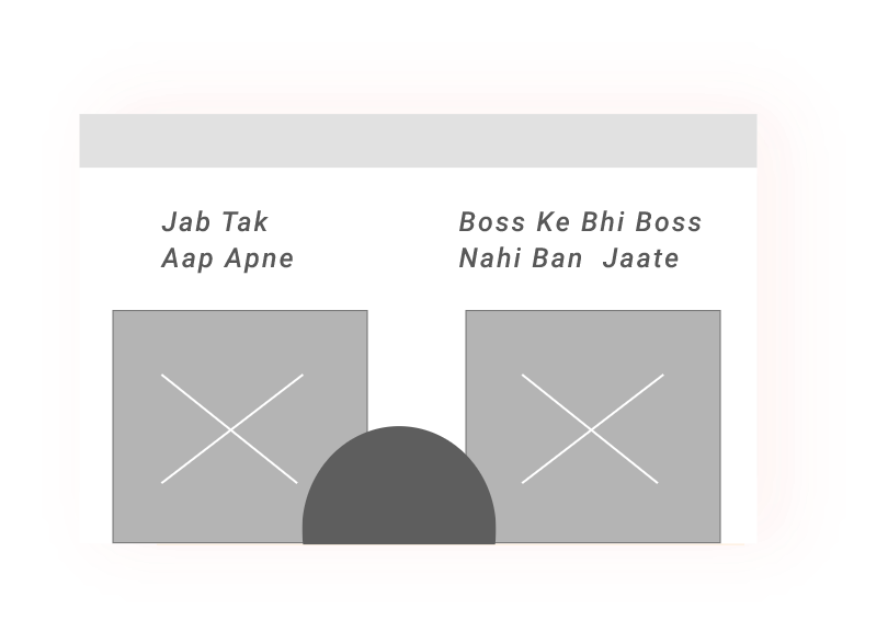
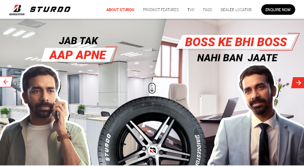
Following the collection of the necessary data. It was time to begin developing concepts and plans. In order to design information architecture and user flow, we first decided on all the major features and their use cases before formulating user stories. The user stories were then used to define the scope of the project. In addition, we determined all the necessary features and their interactions. The final steps included wireframing, style guide and prototyping.
04
Black is a Power colour that represents Elegance, sophistication, status, formality. Based on this, the colour palette shown below is used for Bridgestone.
#231F20
#EF2E24
#A46F2E
Roboto
Headline
Roboto - Black Italic
Body Text
Roboto - Regular
05
06
Take a look at what one of our satisfied customers has to say.
© Copyright 2021 - Bombay Tone