AP Guru
A website where students can evaluate their preparation for advanced placement exams like the SAT, ACT, etc.
-
WebApp Design
-
Packaging

01
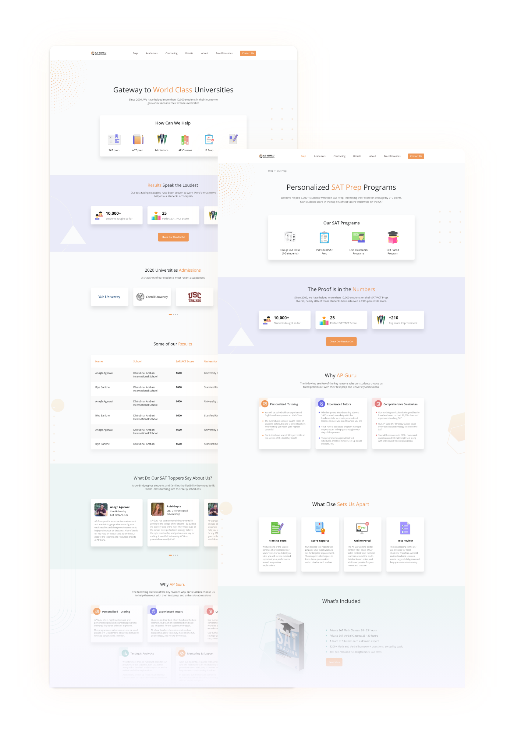
AP Guru, a study portal where students can keep track of their advanced placements preparation like SAT, ACT, etc. We were approached by AP Guru to redesign and enhance their website. They informed us "As the e-learning culture grew in popularity, many online study portals sprung up, but not everyone benefited. That’s because there’s a gap in the experience that people have when they learn online compared to physical class learning. We wish to eradicate this gap!"
02
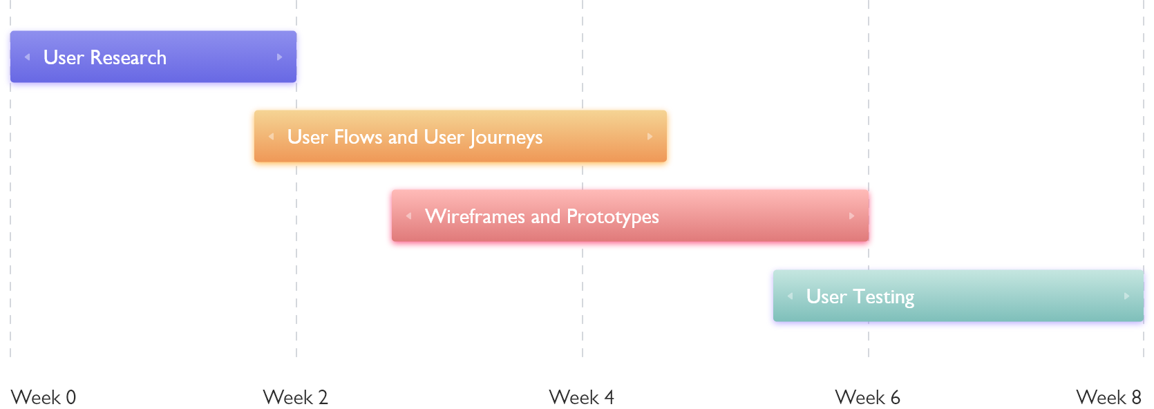
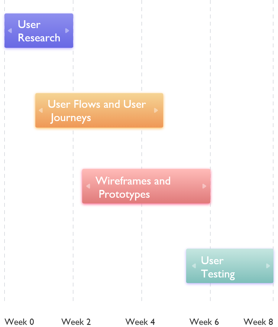
Most of our projects begin with research. And this project was no different. This was the first and the most crucial part of the project. We interviewed the students to understand their needs and issues they were facing. The goal was that the online students can study at their own pace as well as offline students can be updated about their lectures, homework and self study.

03
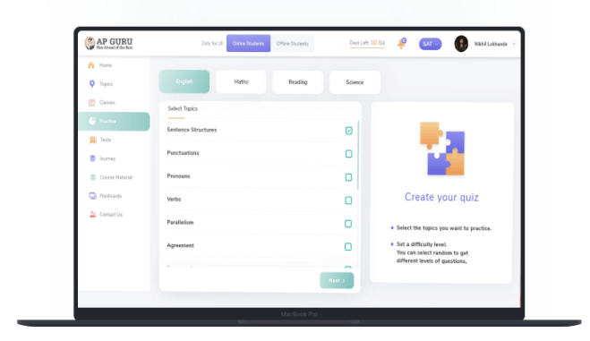
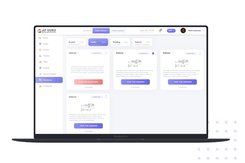
We created a cohesive dashboard with all of the necessary information at a glance, as well as a calendar to keep students informed about their schedule. A card that always reminds the learner of the next job they must do. Self-learning capabilities such as setting quizzes on unique themes they are bad at and flashcards to practise critical points. Analytics on their performance and growth trajectory were displayed.
04
05
Color palettes and typography play a vital part in any website. The color palette shown below is combination of AP Guru logo.
#8E8FEE
#FFBBB8
#F5D494
#C5E6E0
#202224
Open Sans
Headline
Nunito Sans - Bold
70pt
Title
Nunito Sans - Bold
70pt
Body Text
Nunito Sans - Regular
24pt
Hints
Nunito Sans - Regular
8pt
06
The icon and image styles below are used to clearly express an idea or concept and to add aesthetic.
07

08
Black backgrounds create book covers that exude a sense of authority, suspense, or severity. To achieve a significant appearance, brand shades are used, with black being highlighted much more than other shades.

09
10
Take a look at what one of our satisfied customers has to say.
© Copyright 2021 - Bombay Tone